Part two of our “Web Design Dont’s” takes up more web faux pas that should be avoided at all costs.
Monster Paragraphs
The last thing a web visitor wants to see is a block of text with no paragraph breaks. According to studies most people will simply skip over blocks of text which are too large and contain no headings or formatting.
Simply break that chunk of text into smaller sections, each one with its own subject/thought, and then label the section according to that subject/thought with a heading.
Solution:
-Use headings liberally
-Use bullet points
-Use indentation
-Break blocks of text into smaller pieces
Keyword Stuffing
Not only must your copy be properly formatted (as described above) but it must itself be readable and coherent! Many a webmaster or uniformed business owner has made the mistake of putting an un-naturally large amount of keywords in the page’s copy in order to boost the site’s rankings.
This creates an awkward experience for the user and additionally it can penalize your website, as Google frowns upon such practices.
Solution:
Put no more keywords than what would appear naturally! If it feels odd or strange then it means you have too many keywords. This fast and simple rule will be your guiding light in writing copy.
Splash Pages
Believe it or not these are still existent. The problems with splash pages are two fold:
1) It prevents the user from experiencing your website up front, and may cause users to bounce from your page.
2) Hands down the worst con of using a splash page is its crippling effect on your website’s search engine positioning, as the home page is the most important page in Google’s eyes, and you are actively preventing the home page from being reached initially, and instead serving up a very small page with few links and content.
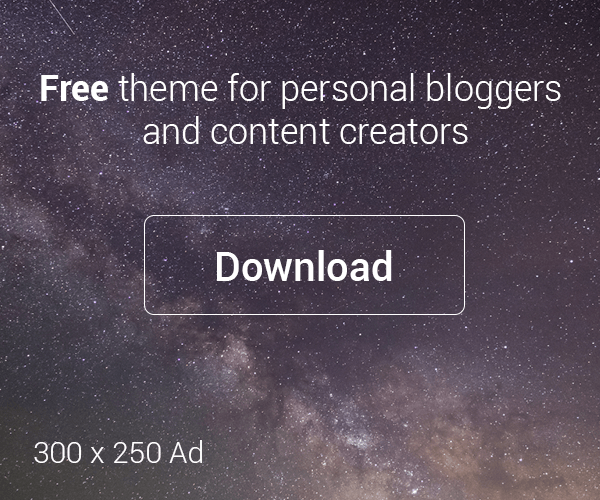
Annoying Banner Ads & Pop-Up Ads
The fastest way to turn off a potential customer is to have large, annoying banner ads at the top of your home page. You should keep banner ads small and positioned on the left or right side of the home page, or even better, at the footer of the homepage in order not to distract potential customers from getting to the most vital information fast.
A lot of browsers have Pop-Up blockers enabled, but not all of them. Research reveals that Pop-Up Ads are highly intrusive and annoying to web site visitors so stay away from these types of obnoxious ads. You only have a few seconds to engage a potential customer’s interest in your web site, make it easy and informative, as opposed to annoying and intrusive.
Stay tuned for future installments of Design Dont’s.